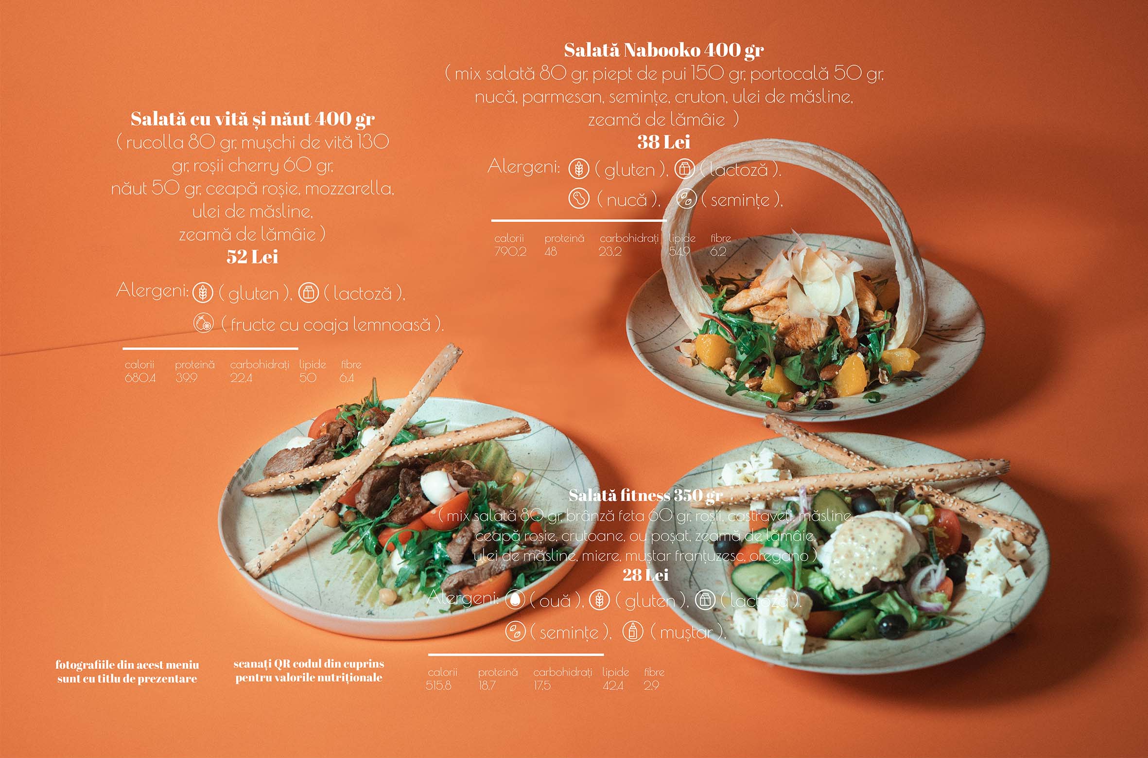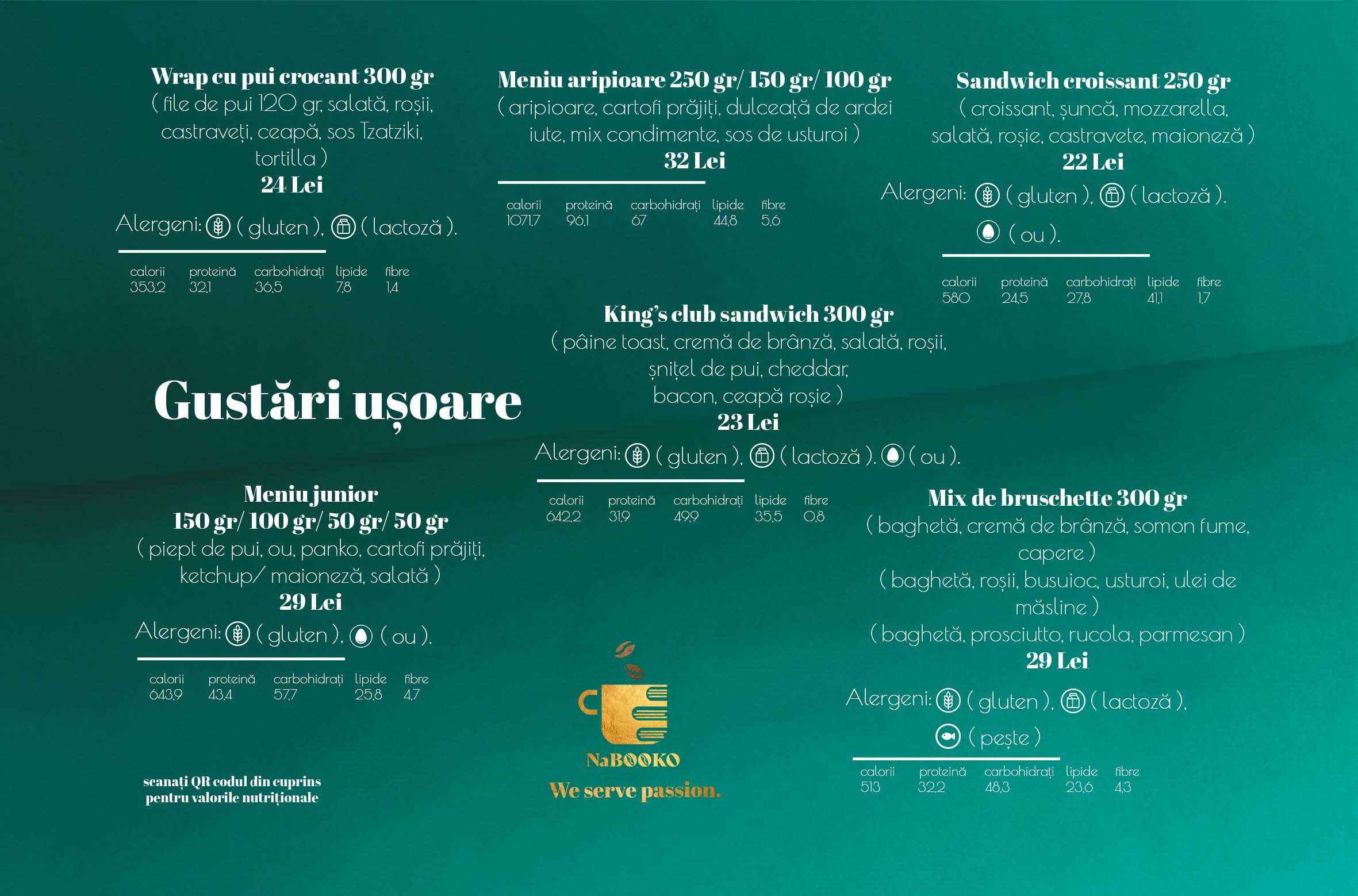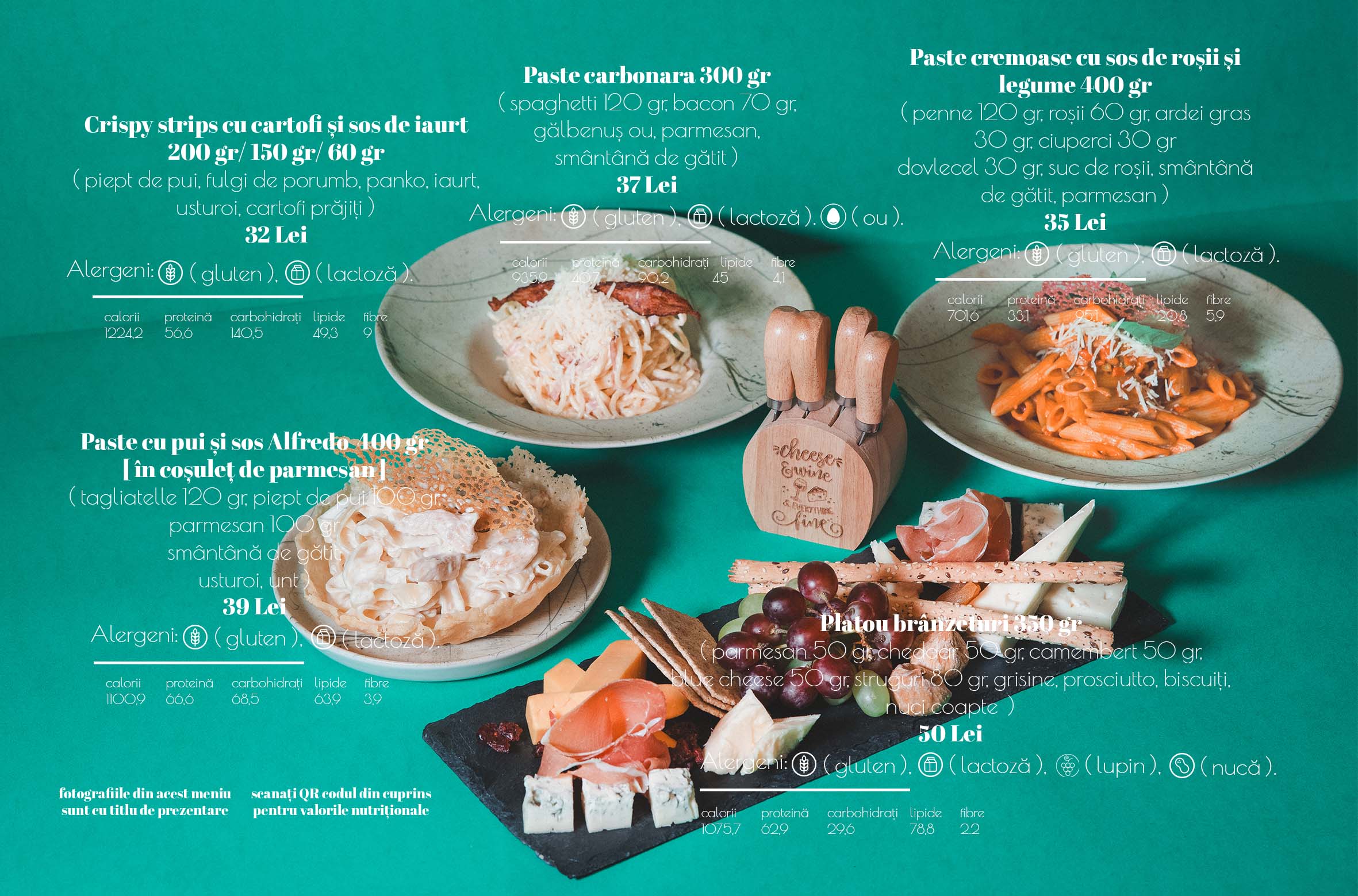

Shaping how a menu is seen, read, and experienced became the core direction of this project for Nabooko, where graphic design met visual storytelling to translate the restaurant’s identity into a format that feels both intuitive and visually engaging.
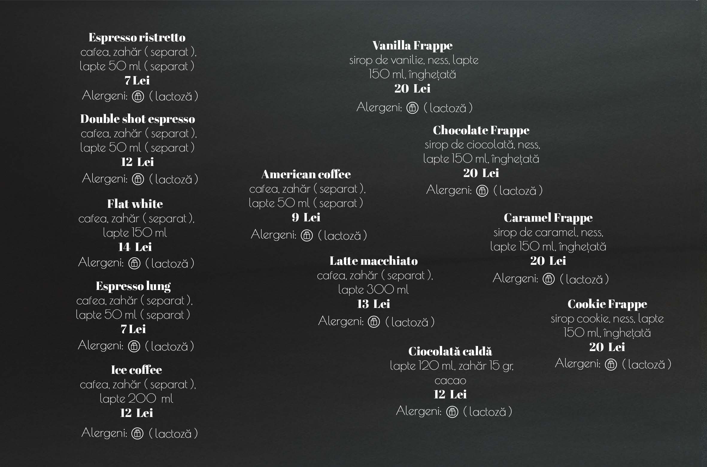
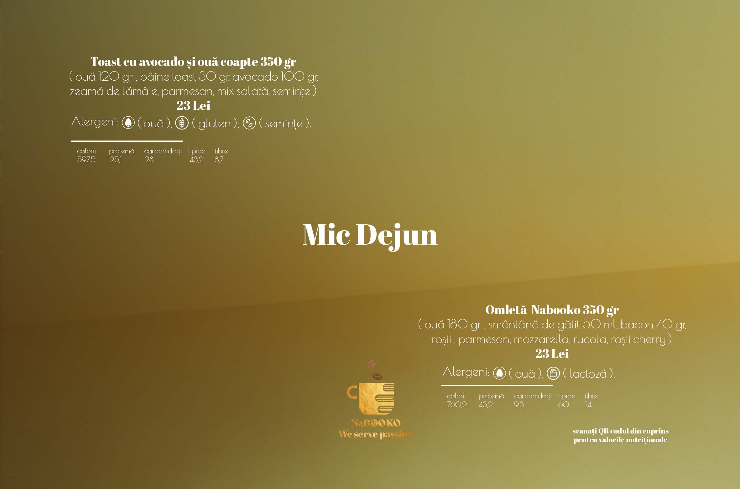
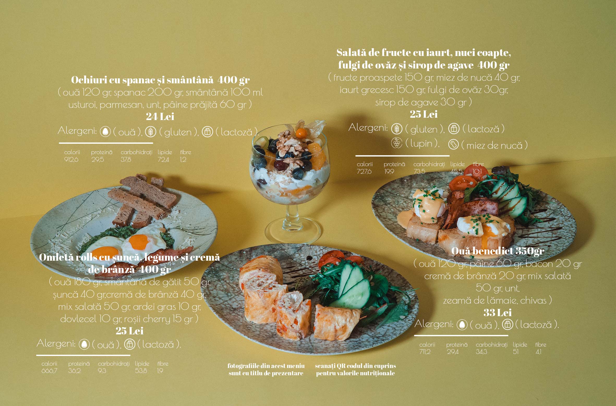
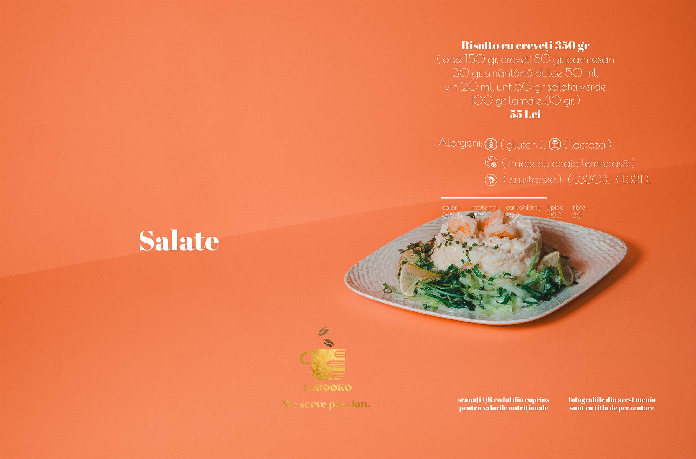
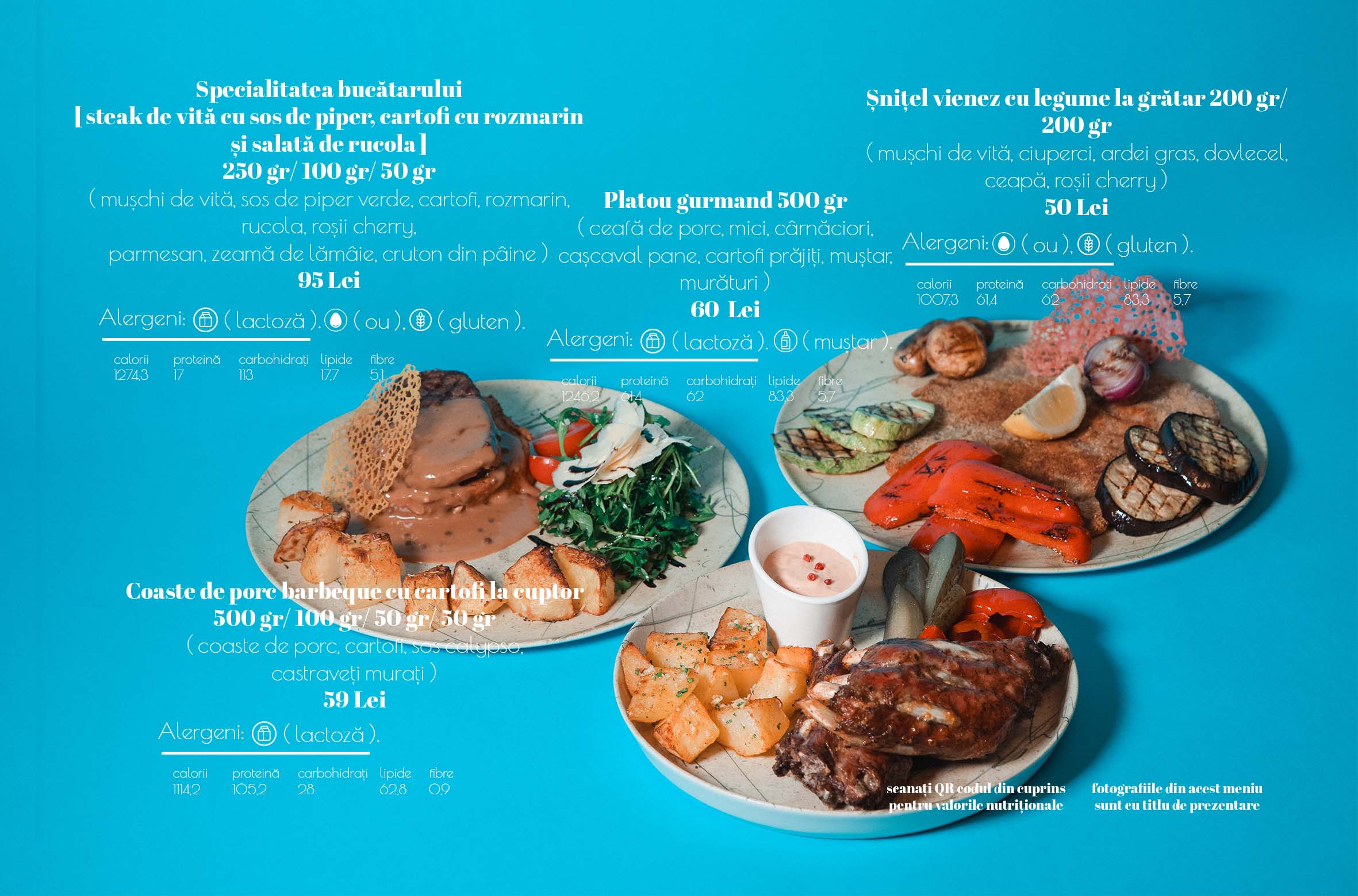
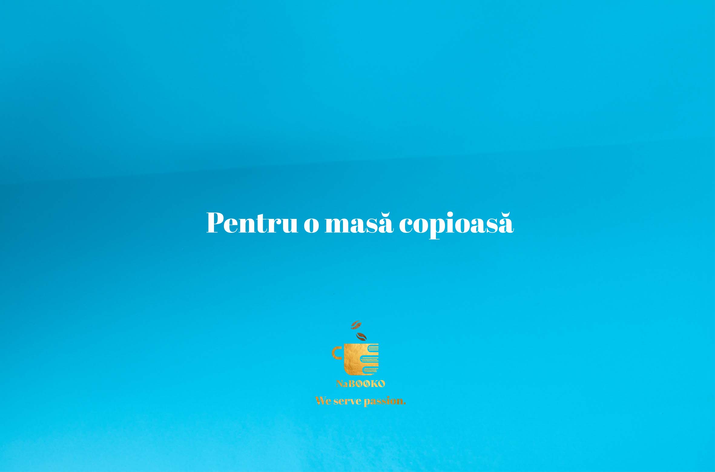
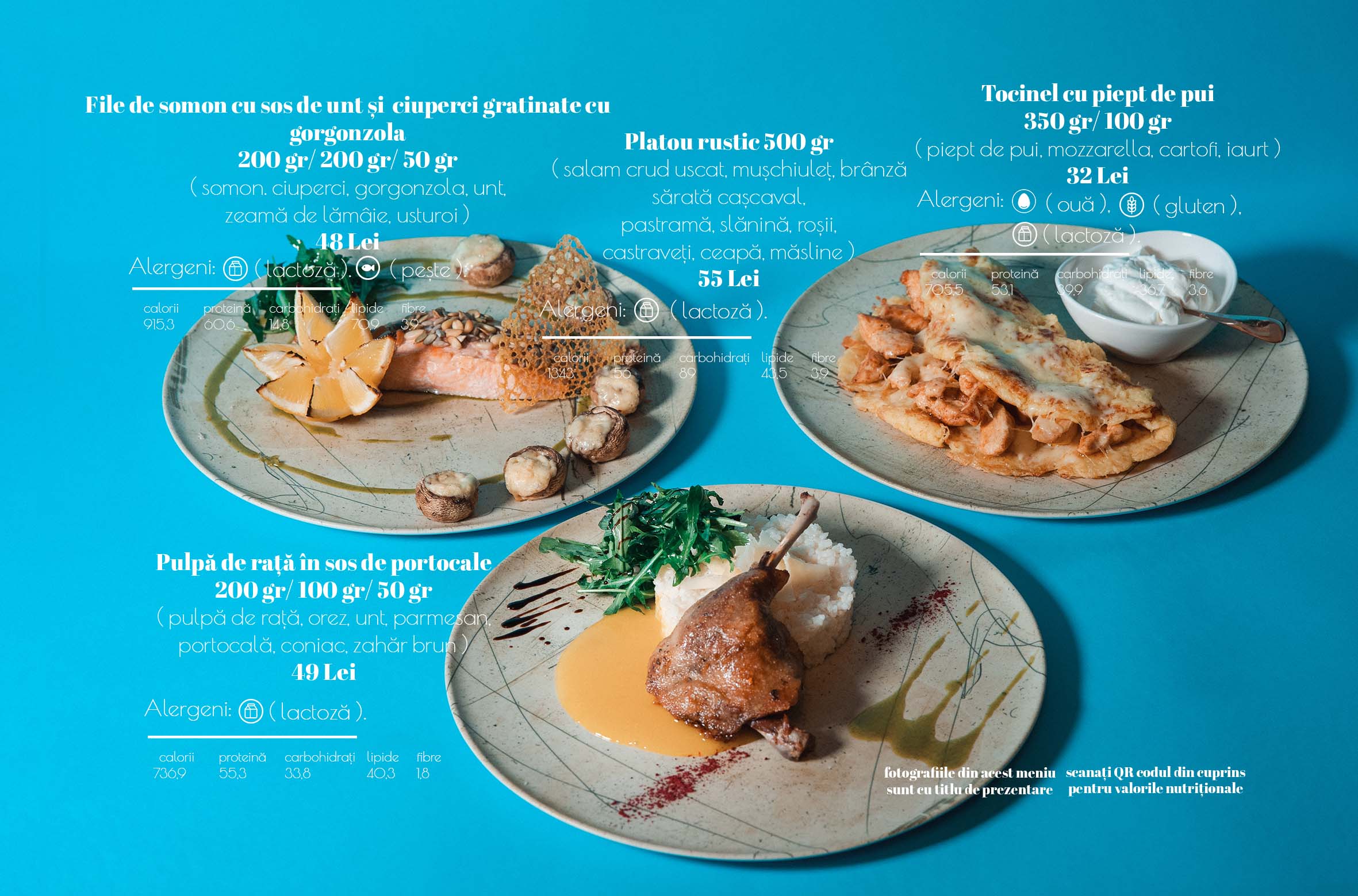
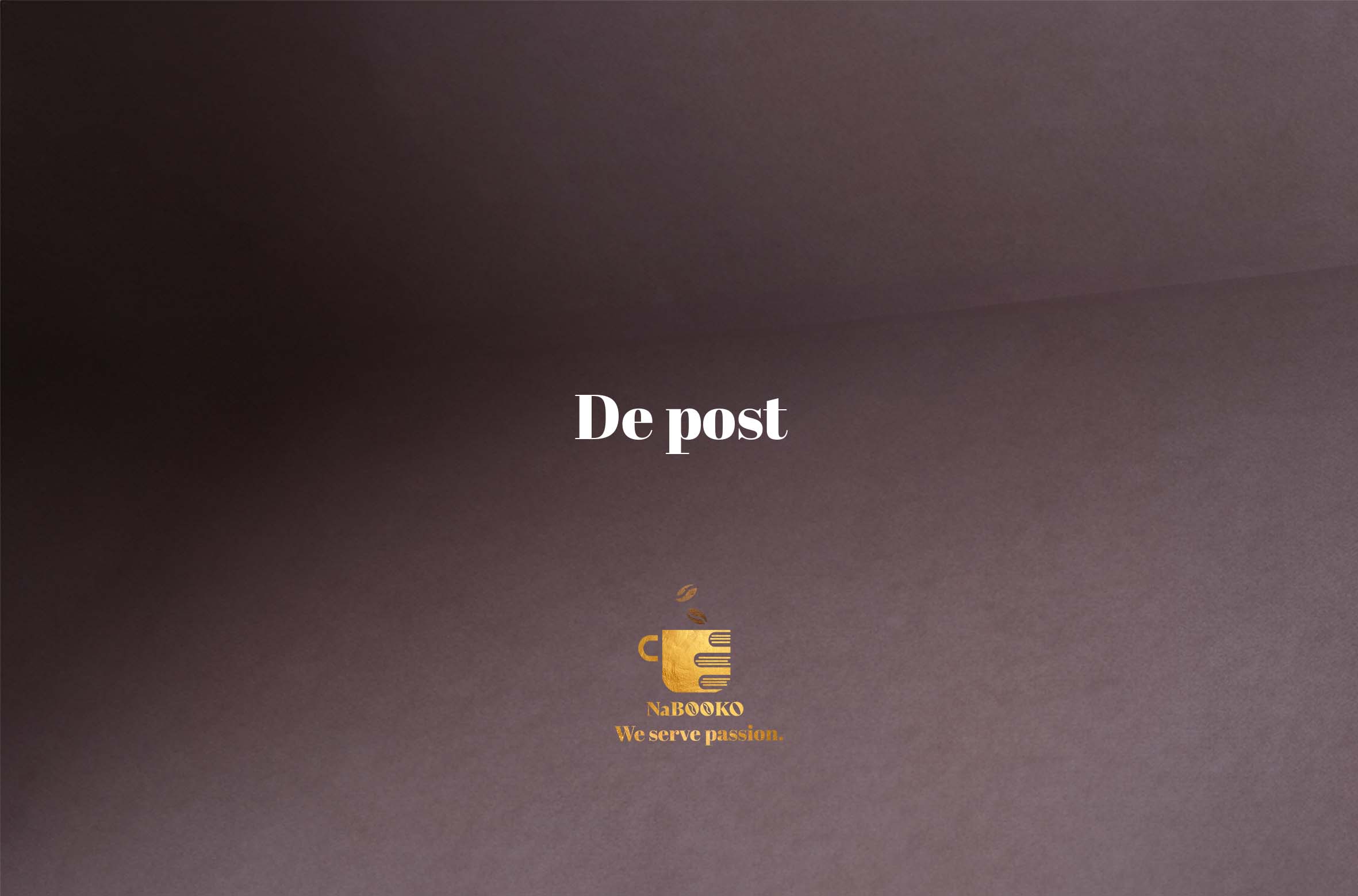
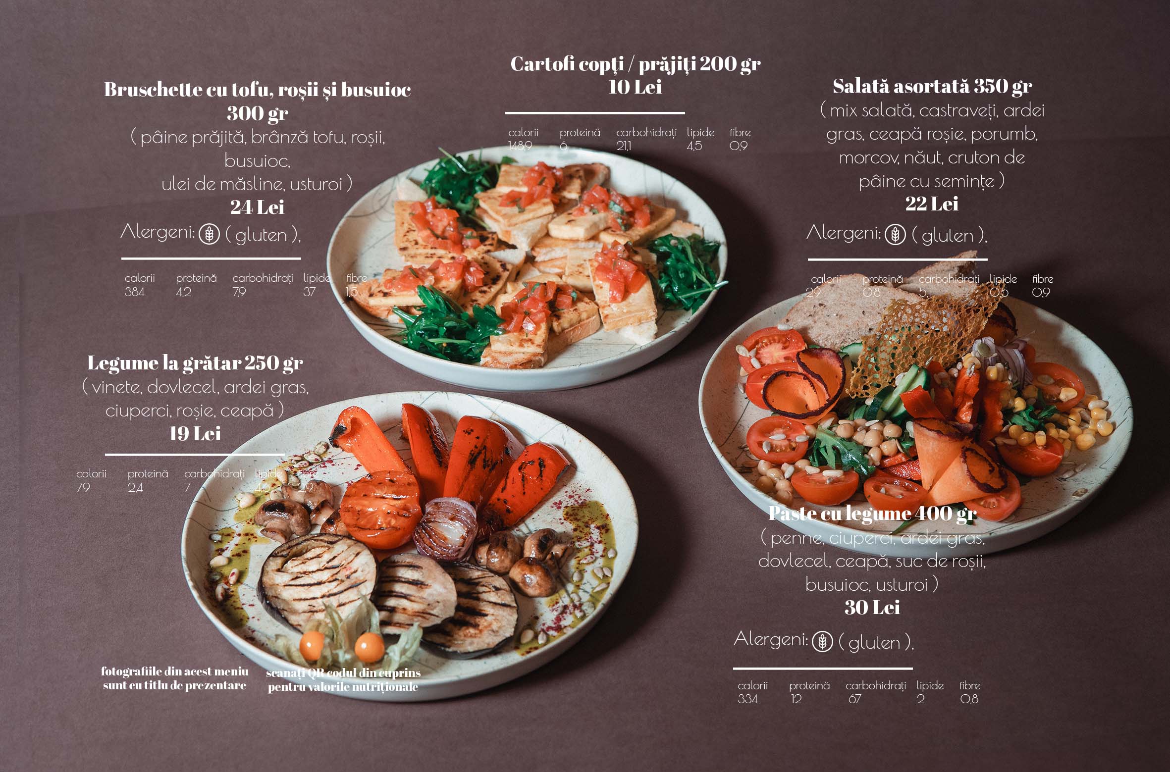
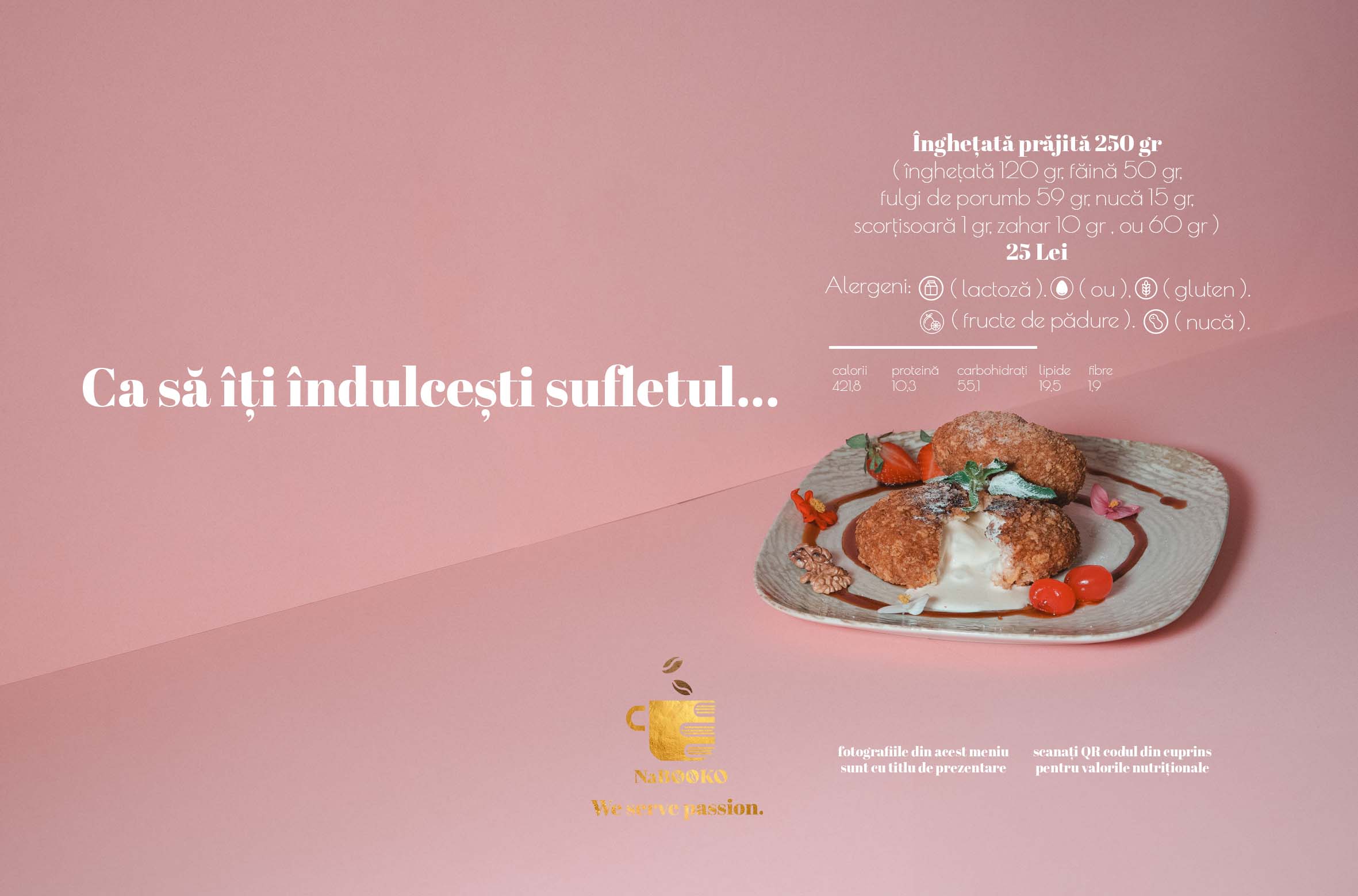
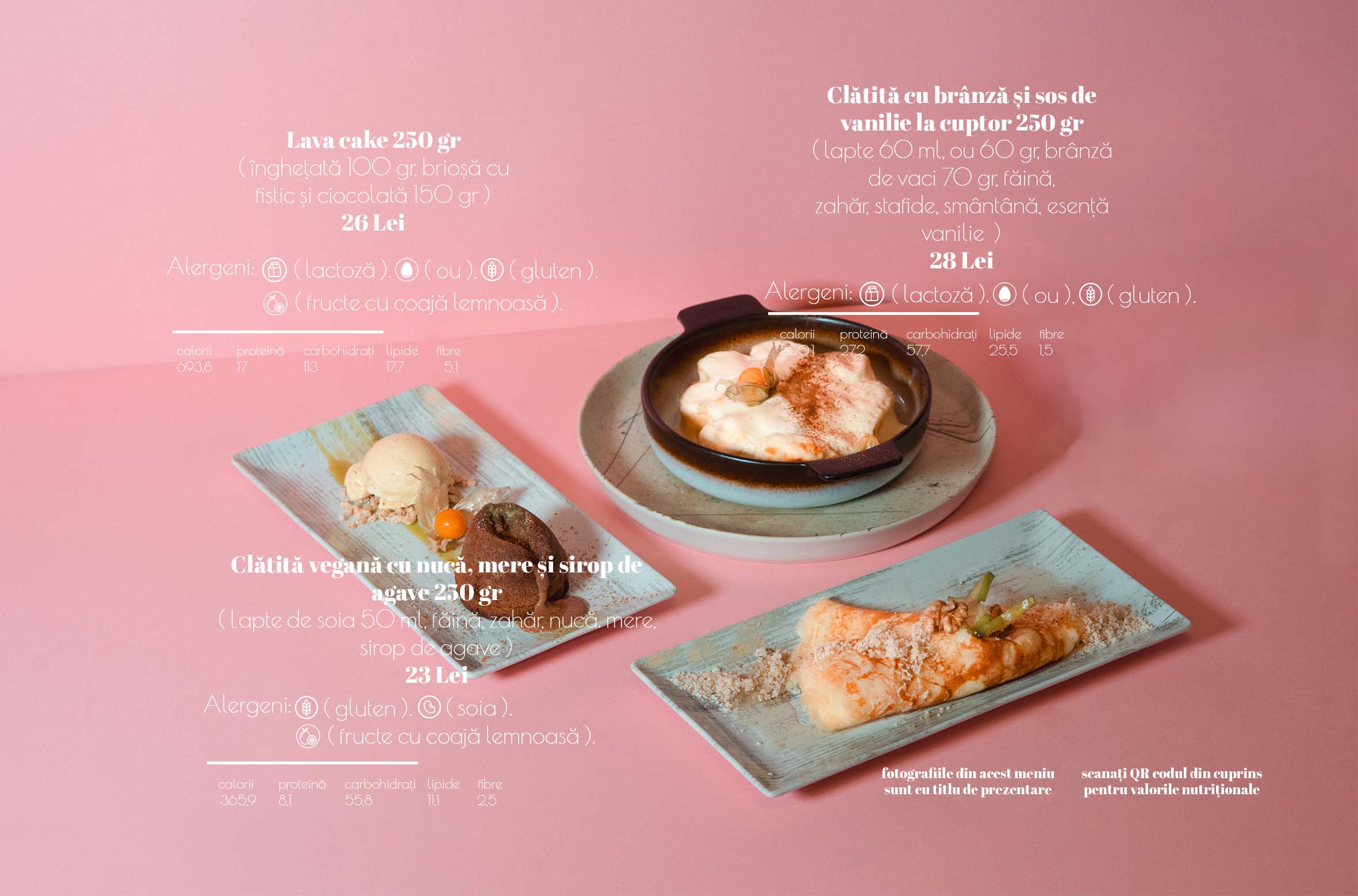
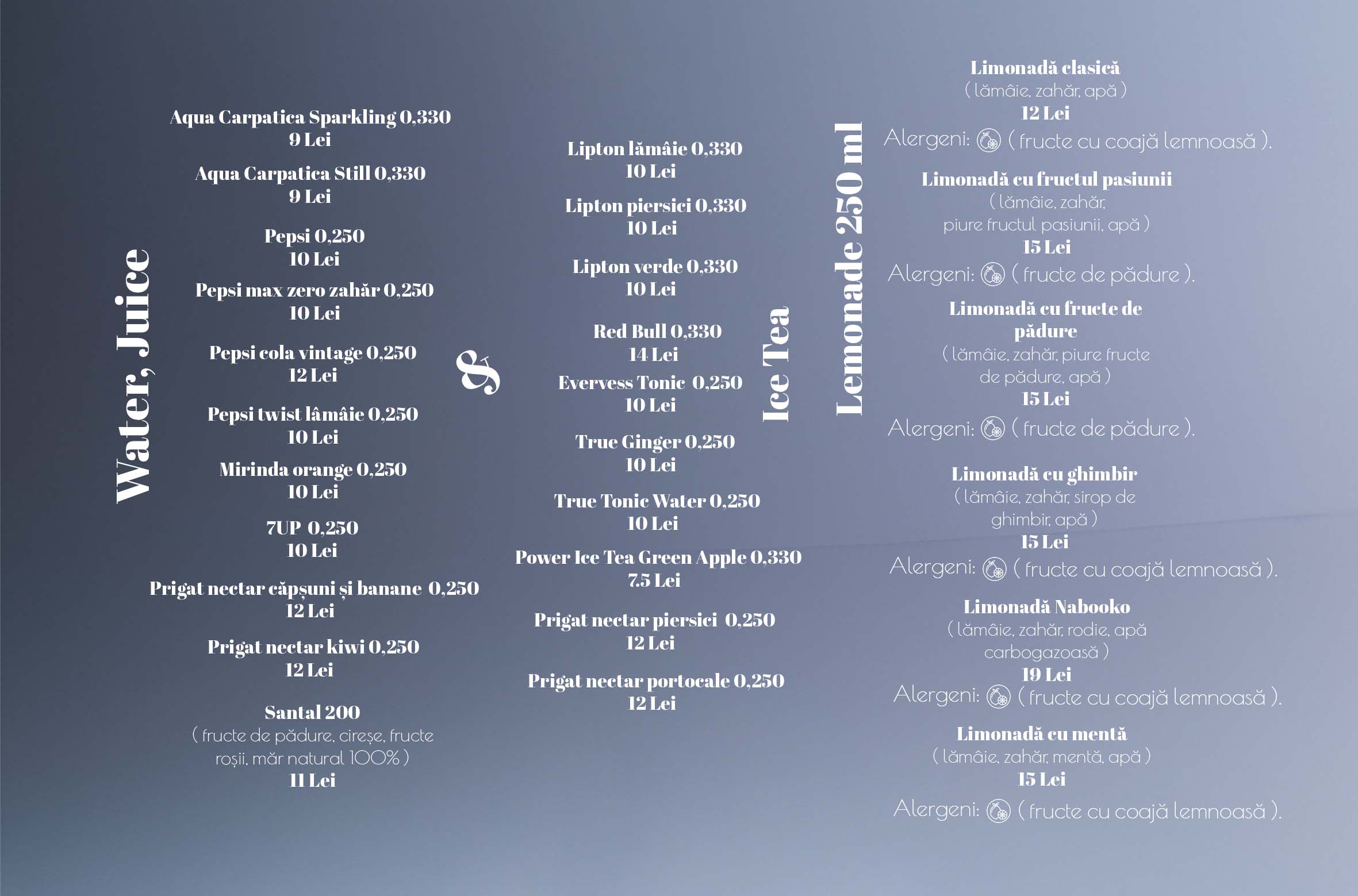
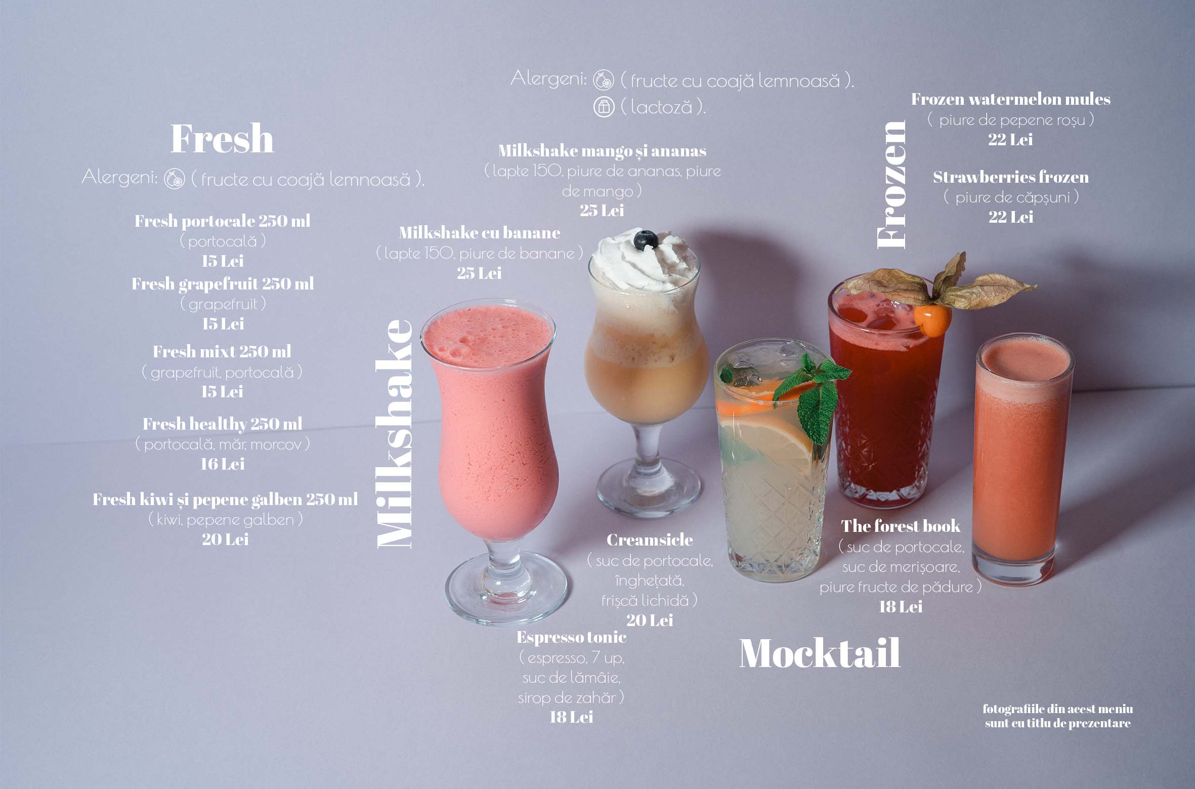
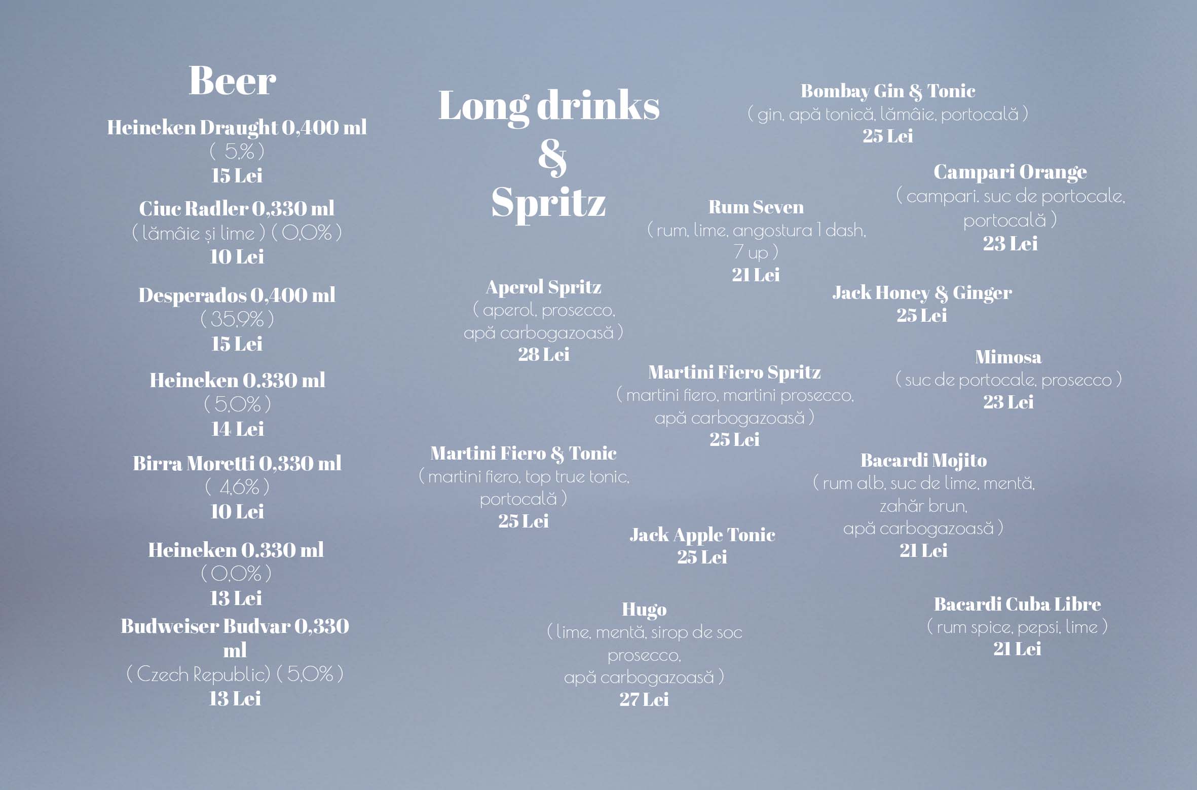
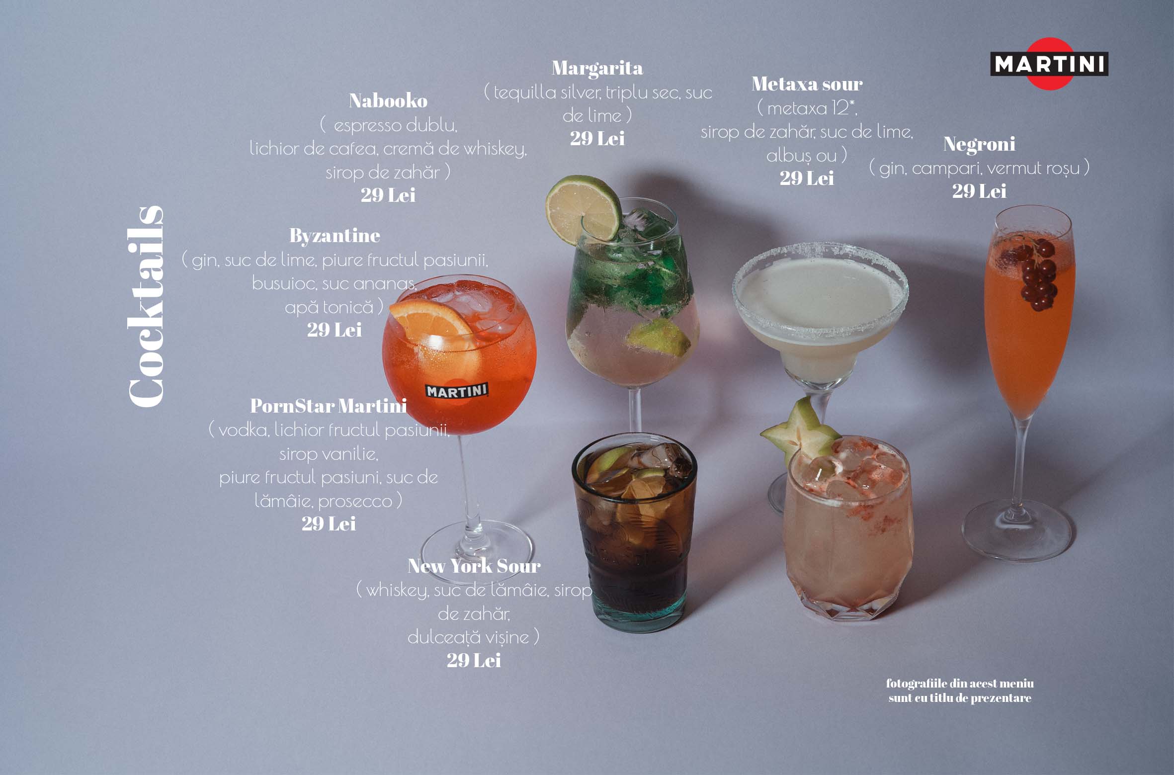
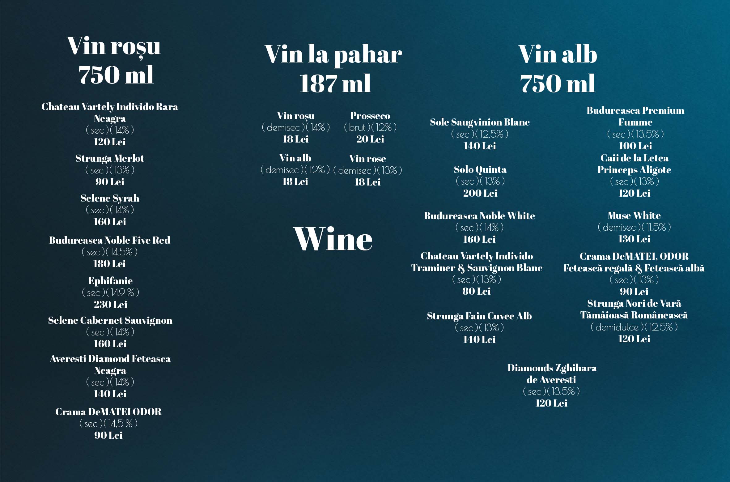
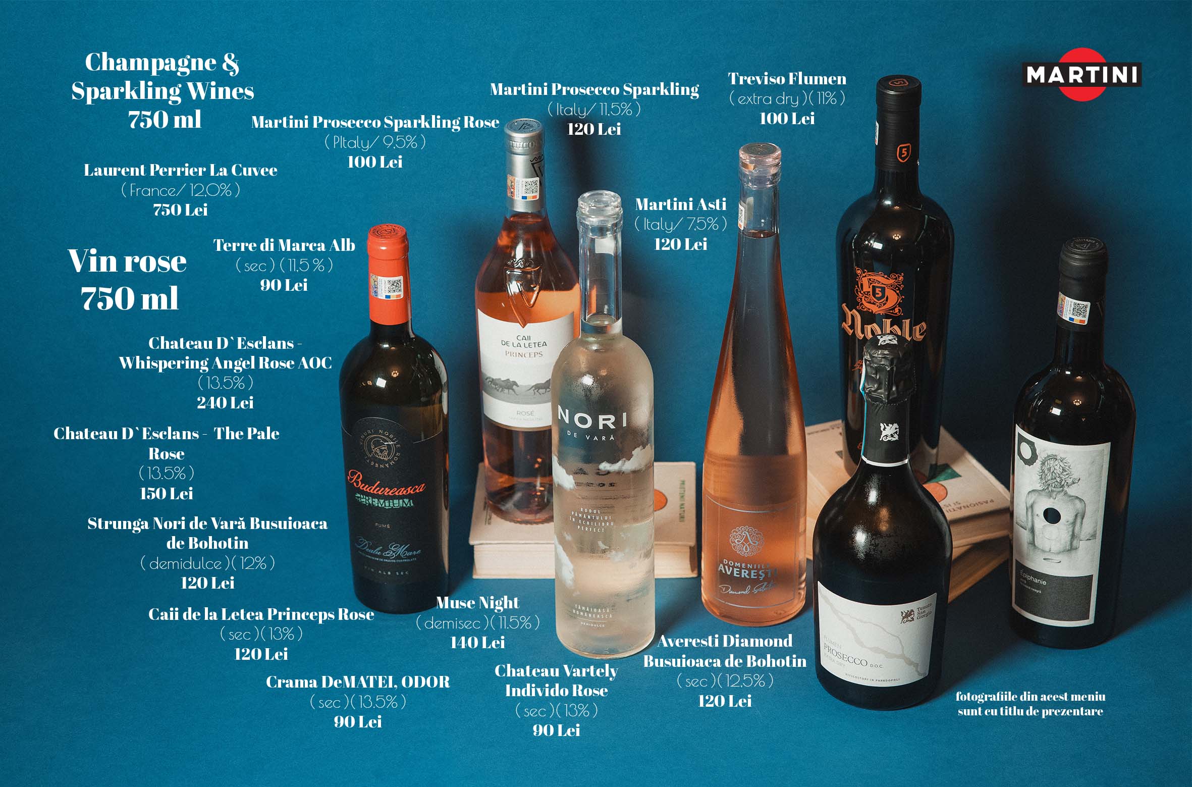
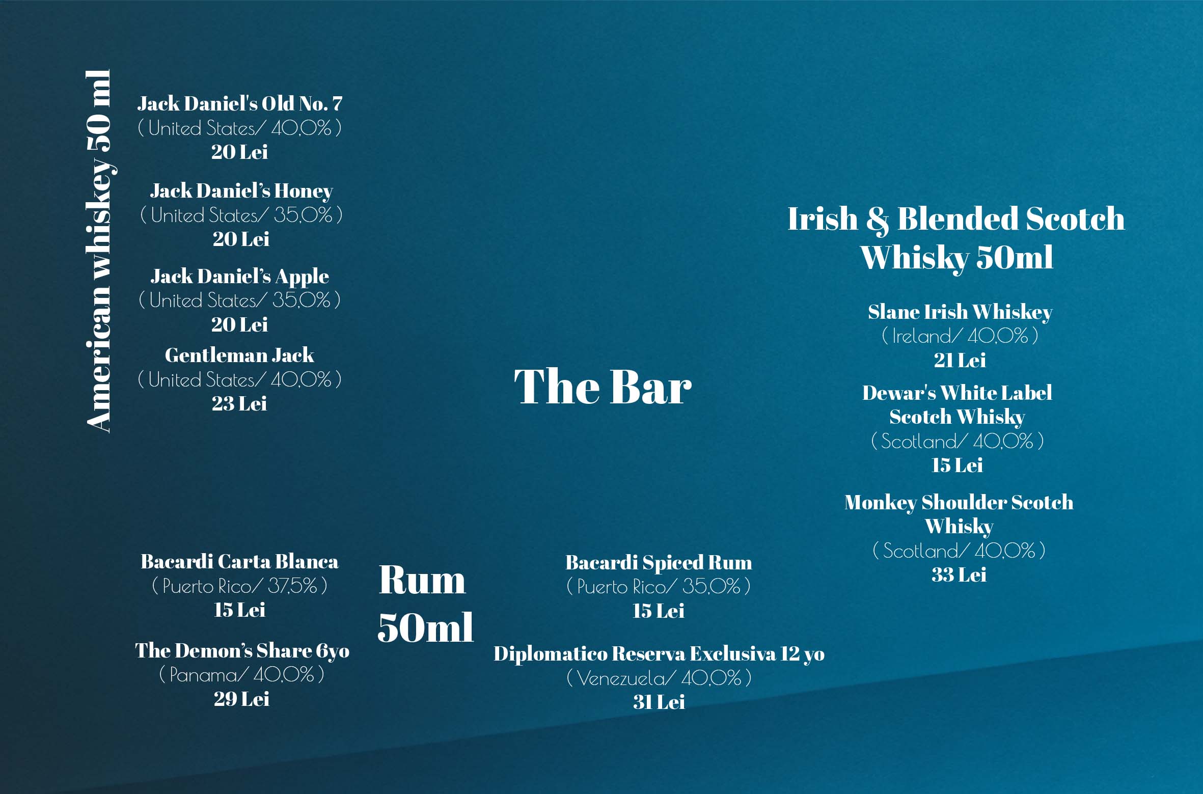
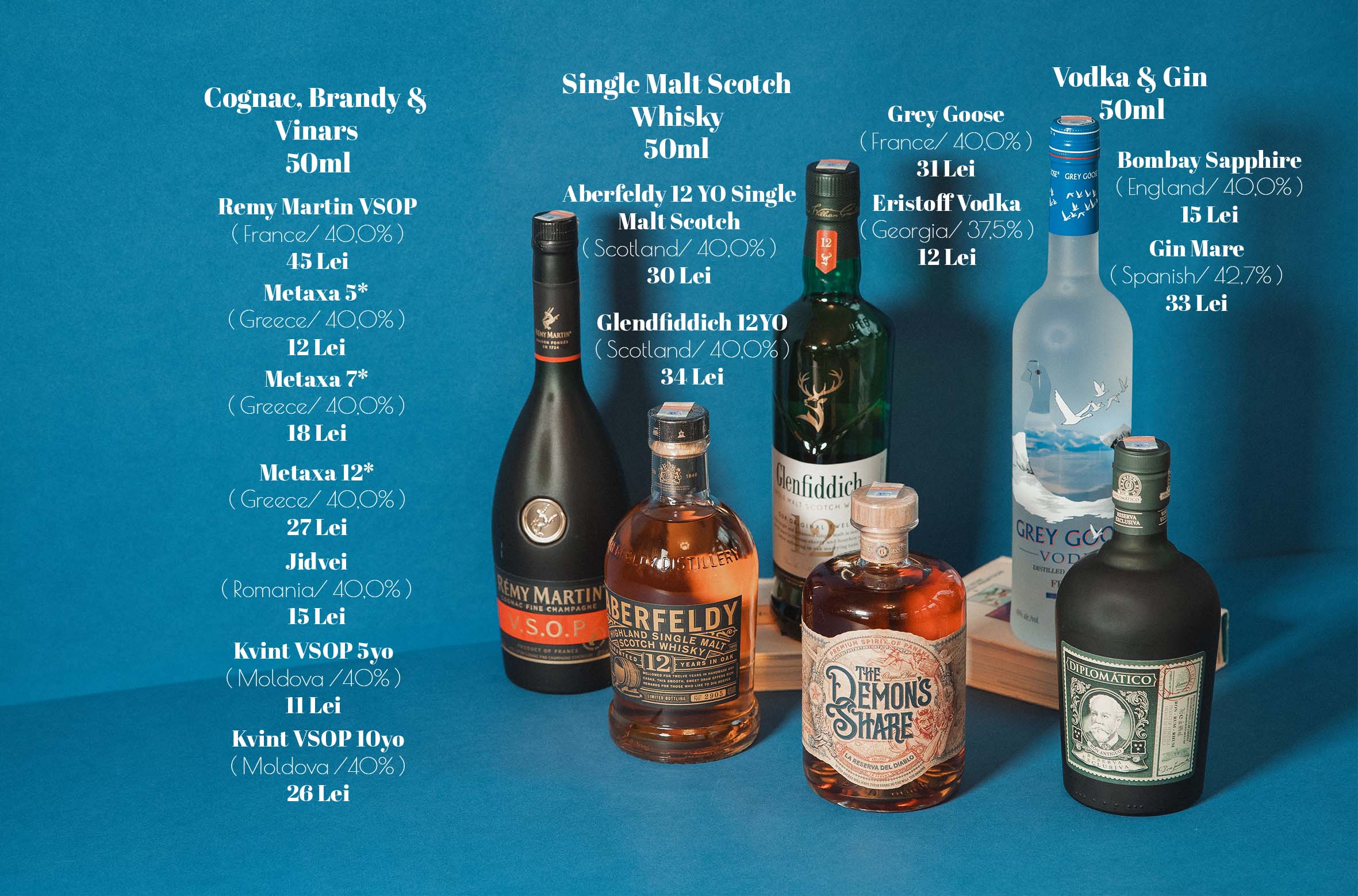
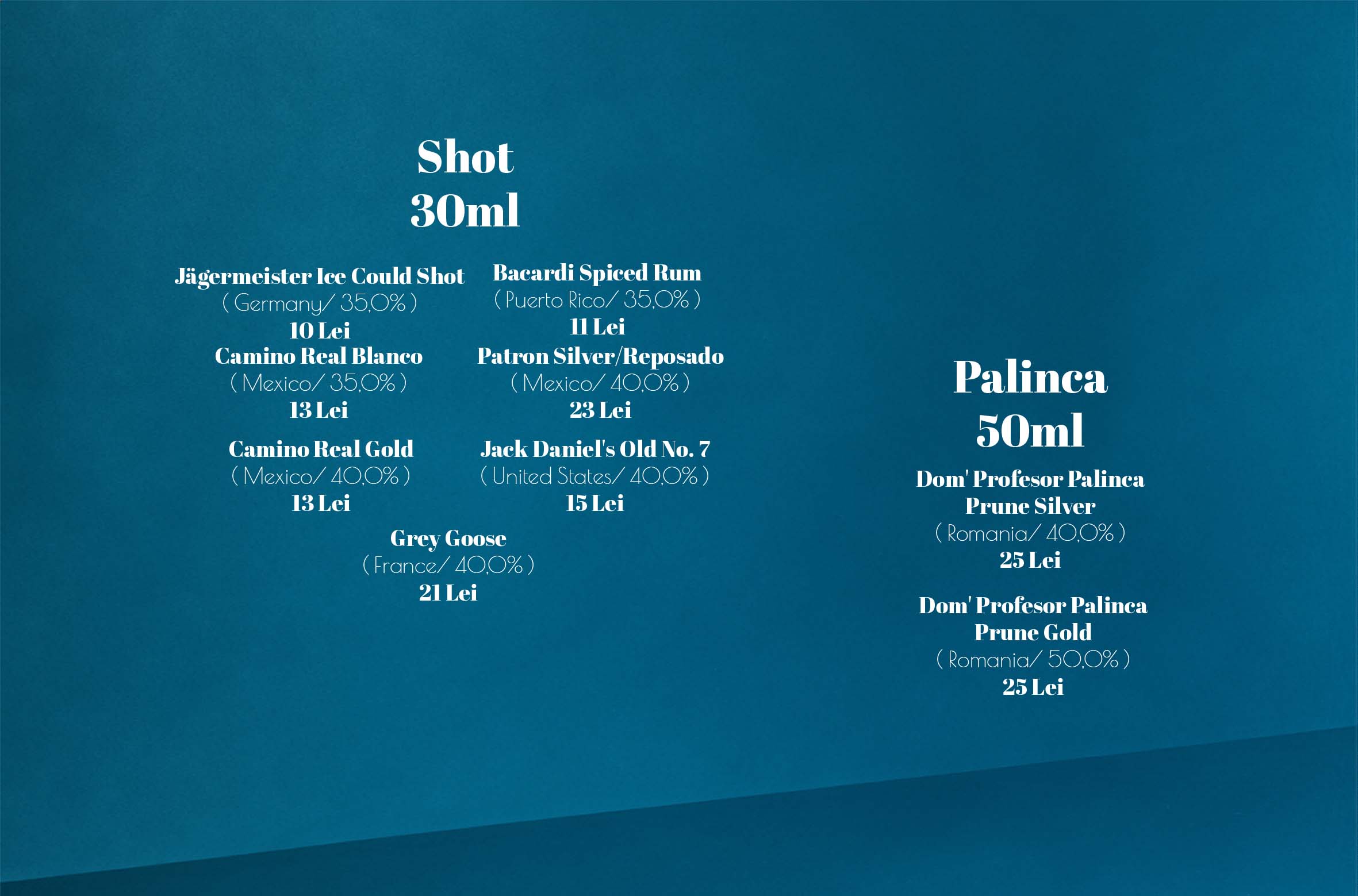
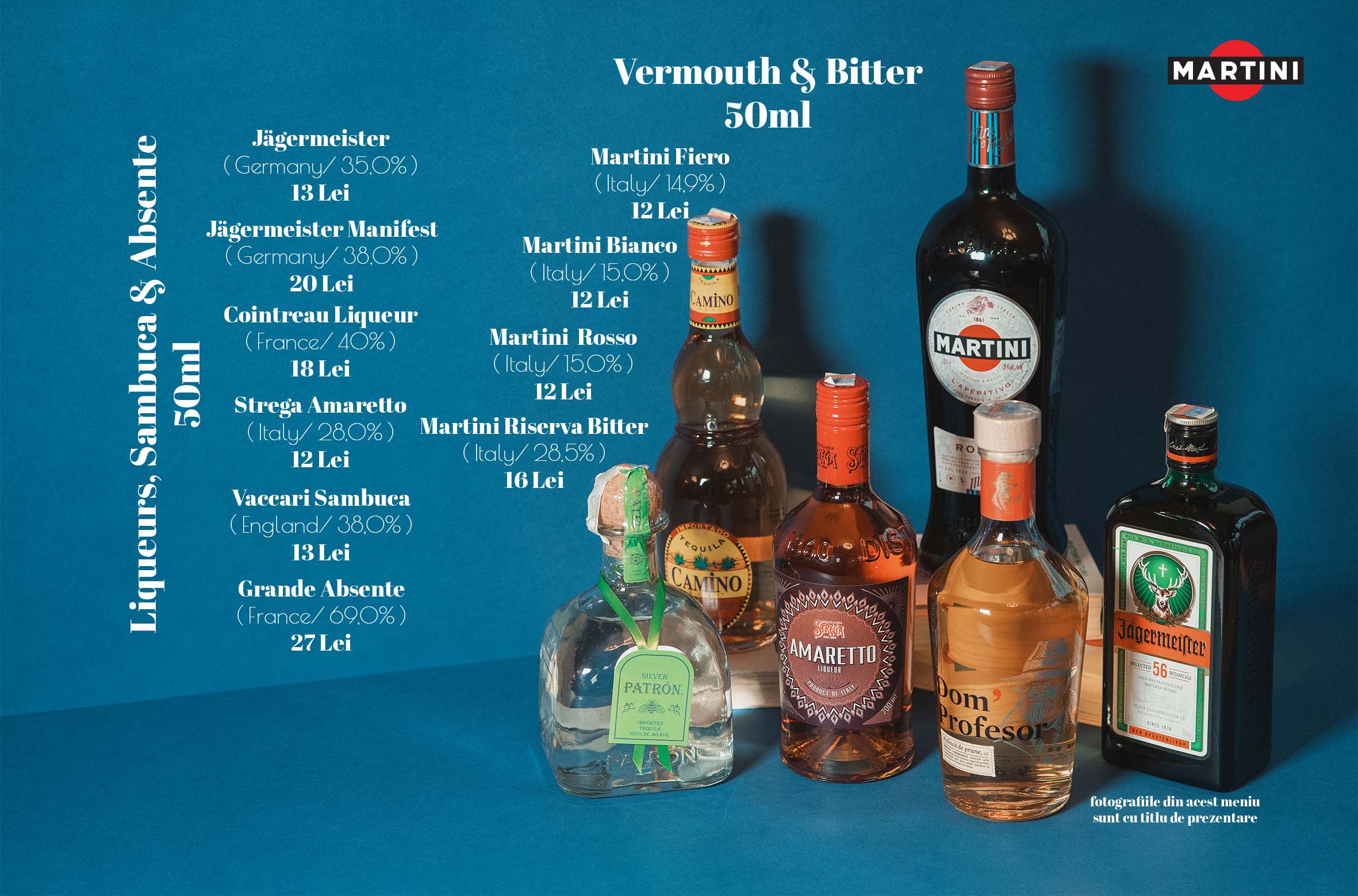
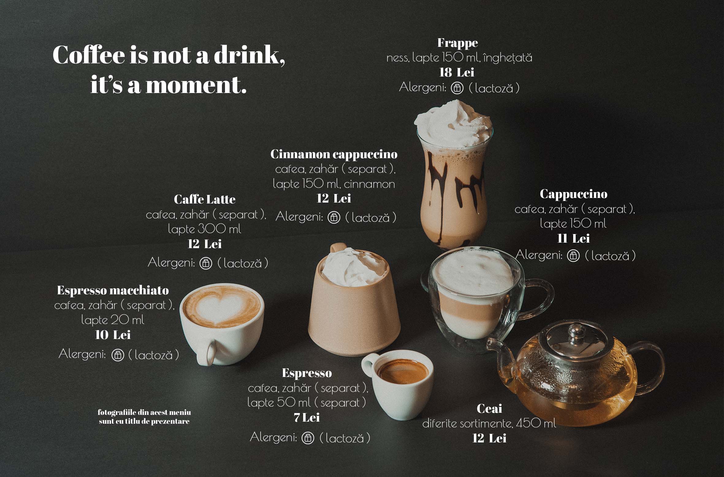
Built around an A5 format, the menu design required a careful structuring of space, combining minimal layout principles with strong visual anchors, where each category was defined through a distinct color background chosen to reflect both the mood of the dishes and the overall atmosphere of the restaurant: black for coffee, creating contrast and depth; warm yellow for breakfast, inspired by morning light; a soft salmon tone for salads, suggesting freshness and lightness; turquoise for light bites, evoking a clean and refreshing feel; baby blue for main courses, offering calm balance for richer dishes; a subtle brown for fasting options, grounding the selection in simplicity; pink for desserts, adding a playful and indulgent touch; violet for soft drinks and cocktails, bringing energy and variety; and a deep blue for wine and bar selections, conveying elegance and refinement, all integrated with product photography placed directly within the layout to maximize visual impact while maintaining readability and flow.
The result is a menu that doesn’t just list items, but guides the viewer naturally through categories, combining clean typography, carefully selected colors, and integrated imagery to create an experience that is both functional and expressive, aligned with the restaurant’s identity and easy to navigate in a real dining context.